Overlays, zoom and drill-down
These features sit on top of any chart’s series. Overlays mark values on the plot. Zoom, the toolbox, the brush and drill-down let the user explore the data. A timeline steps through a sequence of charts. Each section has a compiled example. The overview covers tooltips, the legend and the event bus, and Trading charts covers multi-pane groups and drawing tools.
Overlays
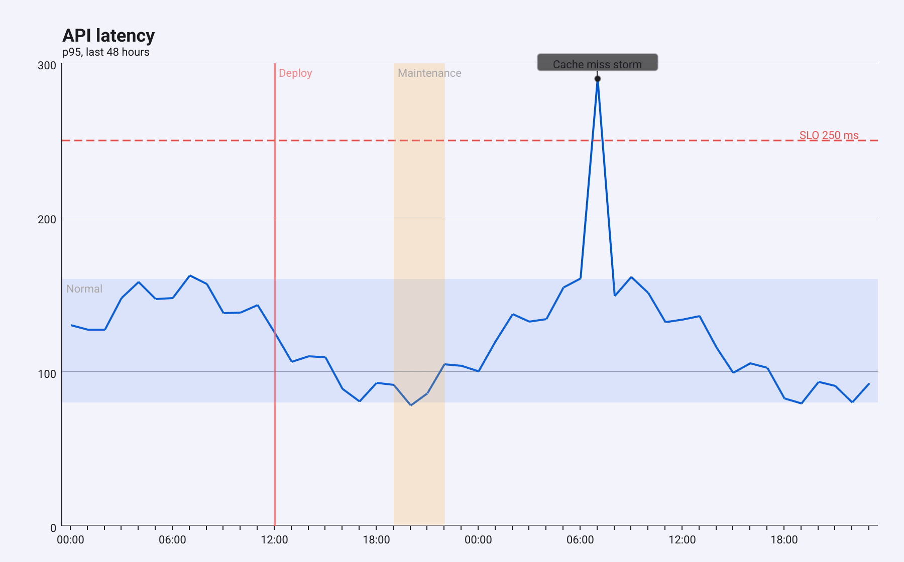
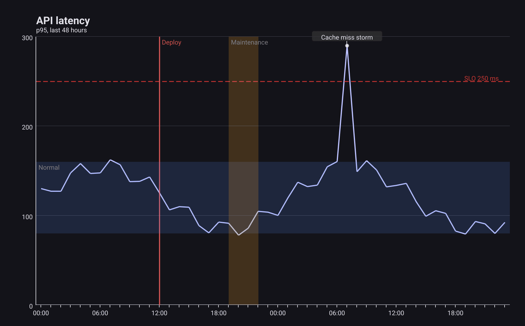
An overlay marks a value on the plot, in data coordinates, so it moves with the data when the user zooms. There are three kinds:
- a
ReferenceLineat one value, such as a target or a limit; - a
ReferenceBandshading the range betweenFromandTo; - an
Annotation, a text label above an X, Y point, with an optional arrow to it.
red := color.NRGBA{R: 229, G: 57, B: 53, A: 220}
overlays := []chart.Overlay{
	// Horizontal: constant Y, across the whole plot.
	&chart.ReferenceLine{
		Axis: chart.AxisHorizontal, Value: 250, Label: "SLO 250 ms",
		Color: red, Dashed: true, DashPattern: []float32{8, 4},
	},
	&chart.ReferenceBand{Axis: chart.AxisHorizontal, From: 80, To: 160, Label: "Normal"},
	// Vertical: constant X. On a category axis X is the category index.
	&chart.ReferenceBand{
		Axis: chart.AxisVertical, From: 19, To: 22, Label: "Maintenance",
		Color: color.NRGBA{R: 255, G: 167, B: 38, A: 50},
	},
	&chart.ReferenceLine{Axis: chart.AxisVertical, Value: 12, Label: "Deploy", Width: 2},
	// An annotation sits at an X, Y data point.
	&chart.Annotation{X: 31, Y: 290, Text: "Cache miss storm", Arrow: true},
}
Pass the list as Option.Overlays. How they behave:
Axischooses the direction.AxisHorizontalmarks a Y value across the whole width;AxisVerticalmarks an X value across the whole height. On a category axis, X is the category index.YAxisIndexpicks the Y axis a horizontal line, band or annotation is measured against, when the chart has several.Widthis the line width (default 1.5).Dasheddashes the line, 6 pixels on and 4 off unlessDashPatternsays otherwise.- With no
Color, lines and bands use the theme’s overlay colours, and annotations the title colour. - A line’s label sits at the right end of a horizontal line, or at the top of a vertical one. A band’s label sits in its top-left corner.
- An annotation whose point is outside the plot, for example after zooming, is not drawn.
Overlays need axes: on a chart with only pie, gauge or other self-laid-out series, they are not drawn.
Zoom
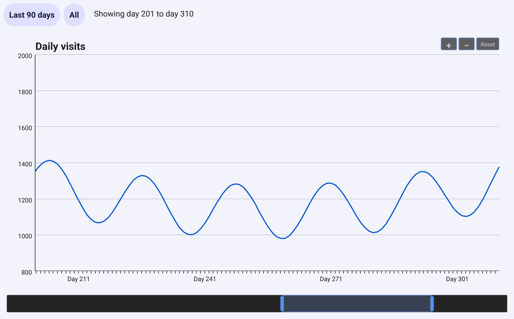
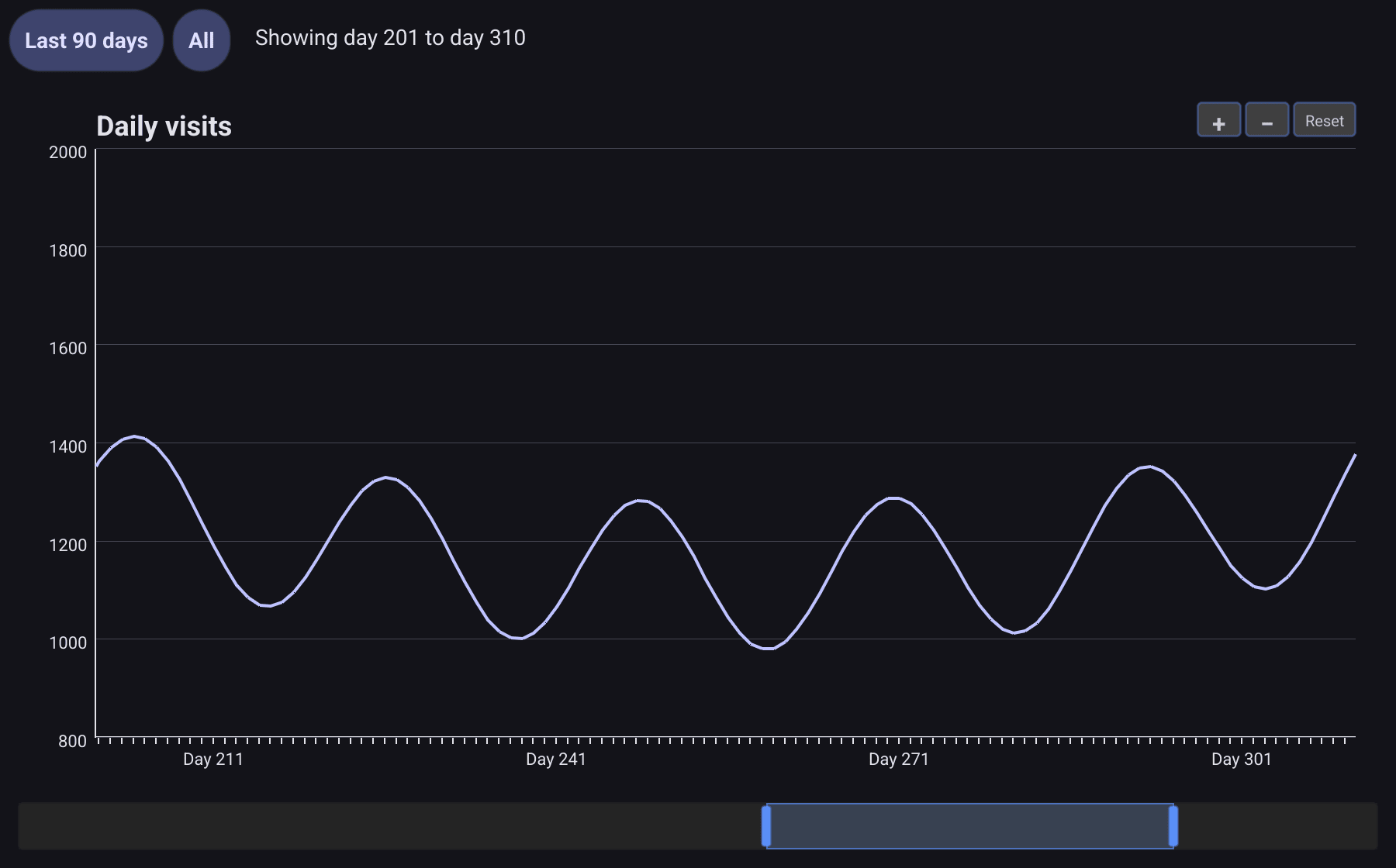
Set DataZoom with Enabled: true and the user can zoom along the X axis:
- the wheel zooms in and out around the pointer;
- once zoomed in, a drag pans;
- the +, − and Reset buttons in the top-right corner zoom around the middle, or show all the data again.
c := chart.New(chart.Option{
	Title: &chart.Title{Text: "Daily visits"},
	// Enabled turns on the wheel, the drag-to-pan and the + − Reset buttons.
	// MinSpan and MaxSpan bound the visible fraction of the data.
	DataZoom: &interact.ZoomConfig{Enabled: true, MinSpan: 0.05, MaxSpan: 1, ZoomSensitivity: 0.1},
	Tooltip:  &component.TooltipConfig{Trigger: component.TooltipTriggerAxis},
	Grid:     &chart.Grid{Left: 56, Right: 20, Top: 12, Bottom: 30},
	XAxis:    []axis.Config{{Type: axis.TypeCategory, Data: days}},
	YAxis:    []axis.Config{{Type: axis.TypeValue}},
	Series:   []series.Series{&series.LineSeries{SeriesName: "Visits", Data: visits}},
})
ZoomConfig
holds the limits. MinSpan and MaxSpan are the smallest and largest part of
the data the user can show, as fractions from 0 to 1. ZoomSensitivity
scales each wheel step.
The visible part is a
DataWindow:
Start and End, also fractions of the full range. Read it with
ZoomWindow(), set it with SetZoomWindow, and listen for
EventZoomChange to hear about changes the user makes.
A zoom slider
component.DataZoomSlider
is a separate widget: a bar with a highlighted window that the user drags by
its body or by either edge. It is not connected to a chart, so you connect it
both ways:
slider := component.NewDataZoomSlider(func(win interact.DataWindow) {
	c.SetZoomWindow(win) // does not emit EventZoomChange, so no loop
	show(win)
})
c.Events.On(interact.EventZoomChange, func(evt interface{}) {
	e := evt.(interact.ZoomChangeEvent)
	slider.SetWindow(interact.DataWindow{Start: e.Start, End: e.End})
	show(interact.DataWindow{Start: e.Start, End: e.End})
})
SetZoomWindow does not send EventZoomChange, so the two handlers cannot
call each other forever. The same goes for buttons that jump to a fixed
range:
lastQuarter := widget.NewButton("Last 90 days", func() {
	win := interact.DataWindow{Start: 1 - 90.0/365, End: 1}
	c.SetZoomWindow(win)
	slider.SetWindow(win)
	show(win)
})
all := widget.NewButton("All", func() {
	c.SetZoomWindow(interact.FullWindow())
	slider.SetWindow(interact.FullWindow())
	show(interact.FullWindow())
})
Some limits of zoom in v1.0.0:
- Only the X axis zooms. The Y axis keeps the range of all the data, as the screenshot shows: the visible values stay between 1000 and 1400 while the axis runs from 800 to 2000.
- Bars and candlesticks keep the width they have at full range, so they look thin when zoomed in far.
SetZoomWindowdoes nothing on a chart withoutDataZoom.- The slider has fixed dark colours that do not follow the theme.
DataZoom with Enabled: false still lets SetZoomWindow move the window,
but the user cannot zoom that chart and it has no buttons. That is how a pane
follows the others in a chart group.
Toolbox
The toolbox adds small buttons at the top right of the chart, under the zoom buttons if there are any.
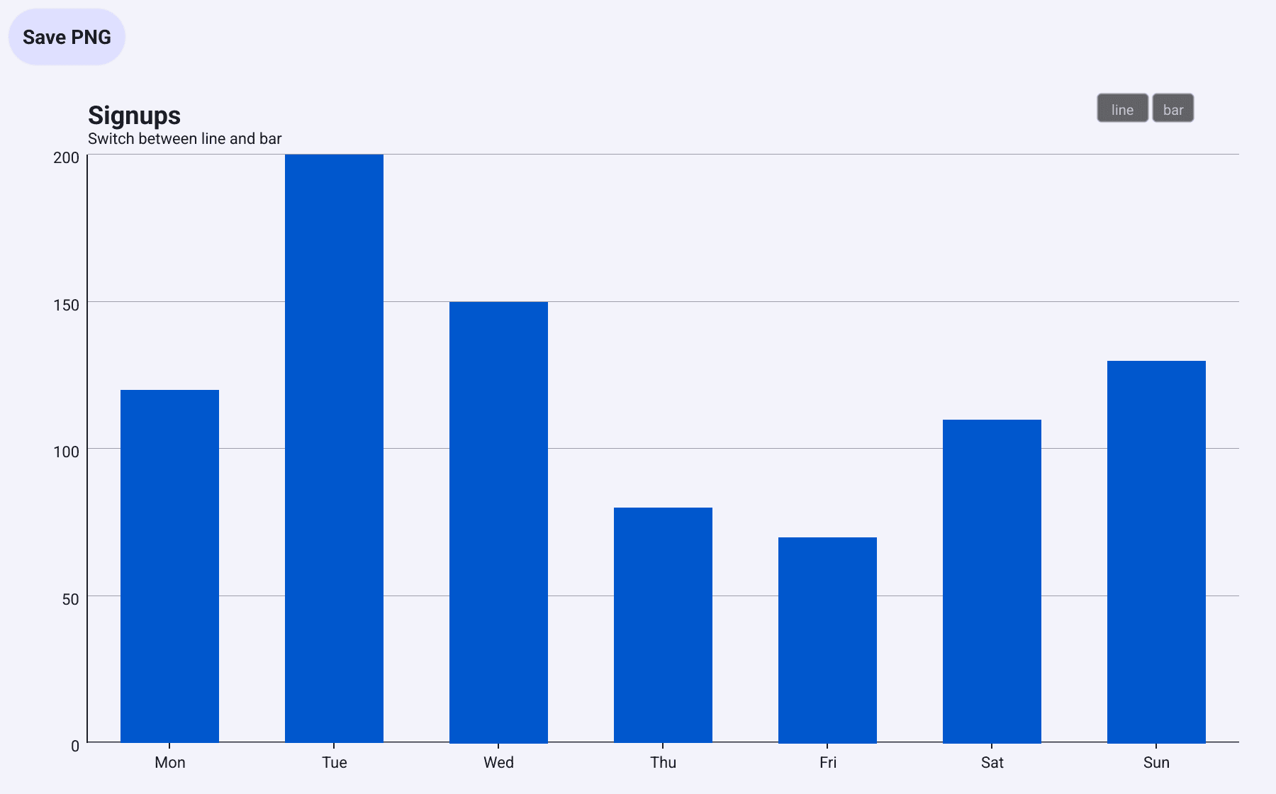
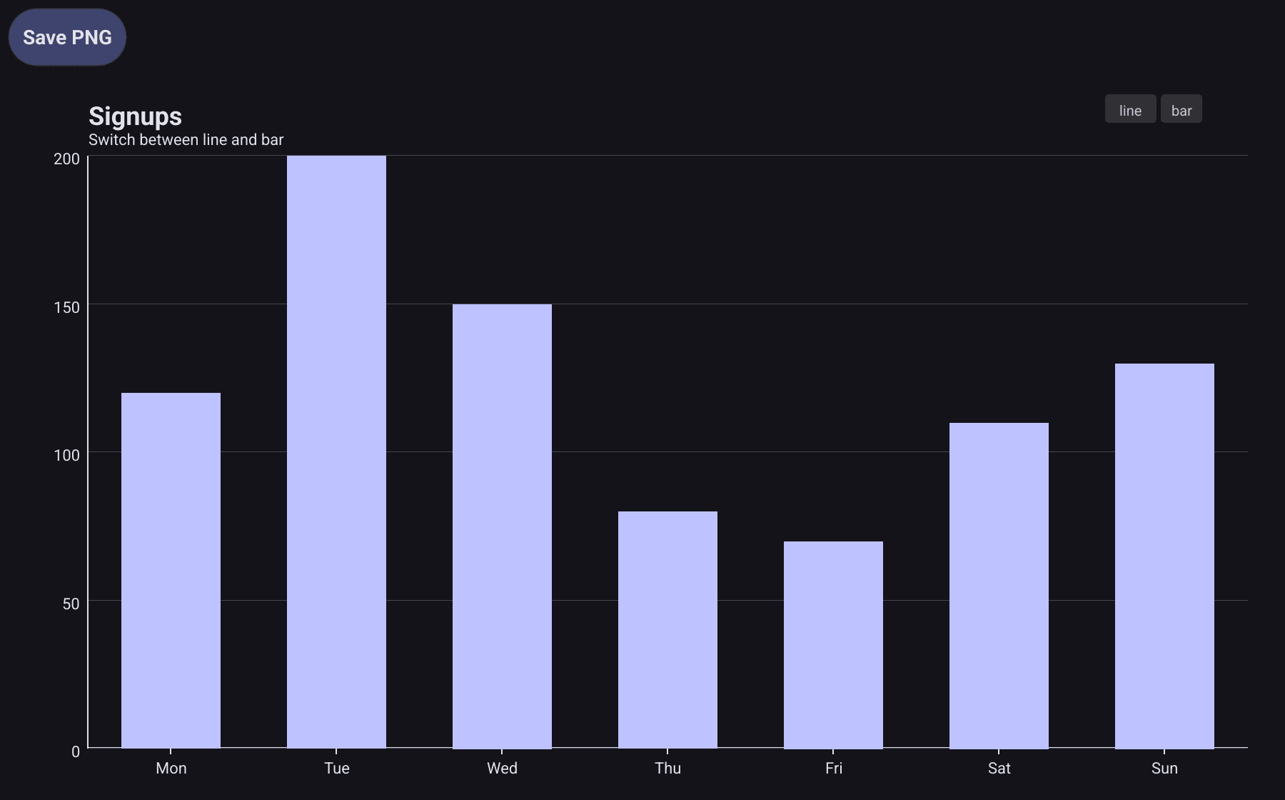
c := chart.New(chart.Option{
	Title: &chart.Title{Text: "Signups", SubText: "Switch between line and bar"},
	Toolbox: &component.ToolboxConfig{
		MagicType: []string{"line", "bar"}, // one button per type
	},
	Grid:  &chart.Grid{Left: 56, Right: 20, Top: 12, Bottom: 30},
	XAxis: []axis.Config{{Type: axis.TypeCategory, Data: []string{"Mon", "Tue", "Wed", "Thu", "Fri", "Sat", "Sun"}}},
	YAxis: []axis.Config{{Type: axis.TypeValue}},
	Series: []series.Series{
		&series.BarSeries{SeriesName: "Signups", Data: []float64{120, 200, 150, 80, 70, 110, 130}},
	},
})
MagicType adds one button per chart type. "line" turns every bar series
into a line series, and "bar" turns every line series into bars. Name, data,
Y axis and stack are kept; other settings of the series, such as colours,
dashes and area fills, are not. Button labels are cut to four letters.
SaveAsImage: true adds a Save button that asks for a file name and
writes a PNG. In v1.0.0 that PNG holds only the chart’s background colour.
Until that is fixed, cut the chart out of a capture of the window instead:
// chartImage returns the pixels of c as they are on screen, cut out of a
// capture of the whole window.
func chartImage(w bellui.Window, c *chart.Chart) image.Image {
	cv := w.Canvas()
	pos := bellui.CurrentApp().Driver().AbsolutePositionForObject(c)
	x0, y0 := cv.PixelCoordinateForPosition(pos)
	x1, y1 := cv.PixelCoordinateForPosition(pos.Add(c.Size()))
	img := cv.Capture()
	if sub, ok := img.(interface {
		SubImage(image.Rectangle) image.Image
	}); ok {
		return sub.SubImage(image.Rect(x0, y0, x1, y1))
	}
	return img
}
save := widget.NewButton("Save PNG", func() {
img := chartImage(w, c)
dialog.ShowFileSave(func(out bellui.URIWriteCloser, err error) {
if err != nil || out == nil {
return // cancelled
}
defer out.Close()
if err := png.Encode(out, img); err != nil {
dialog.ShowError(err, w)
}
}, w)
})Capture returns what is on screen, at the screen’s pixel density, so the
image is as sharp as the window.
Brush selection
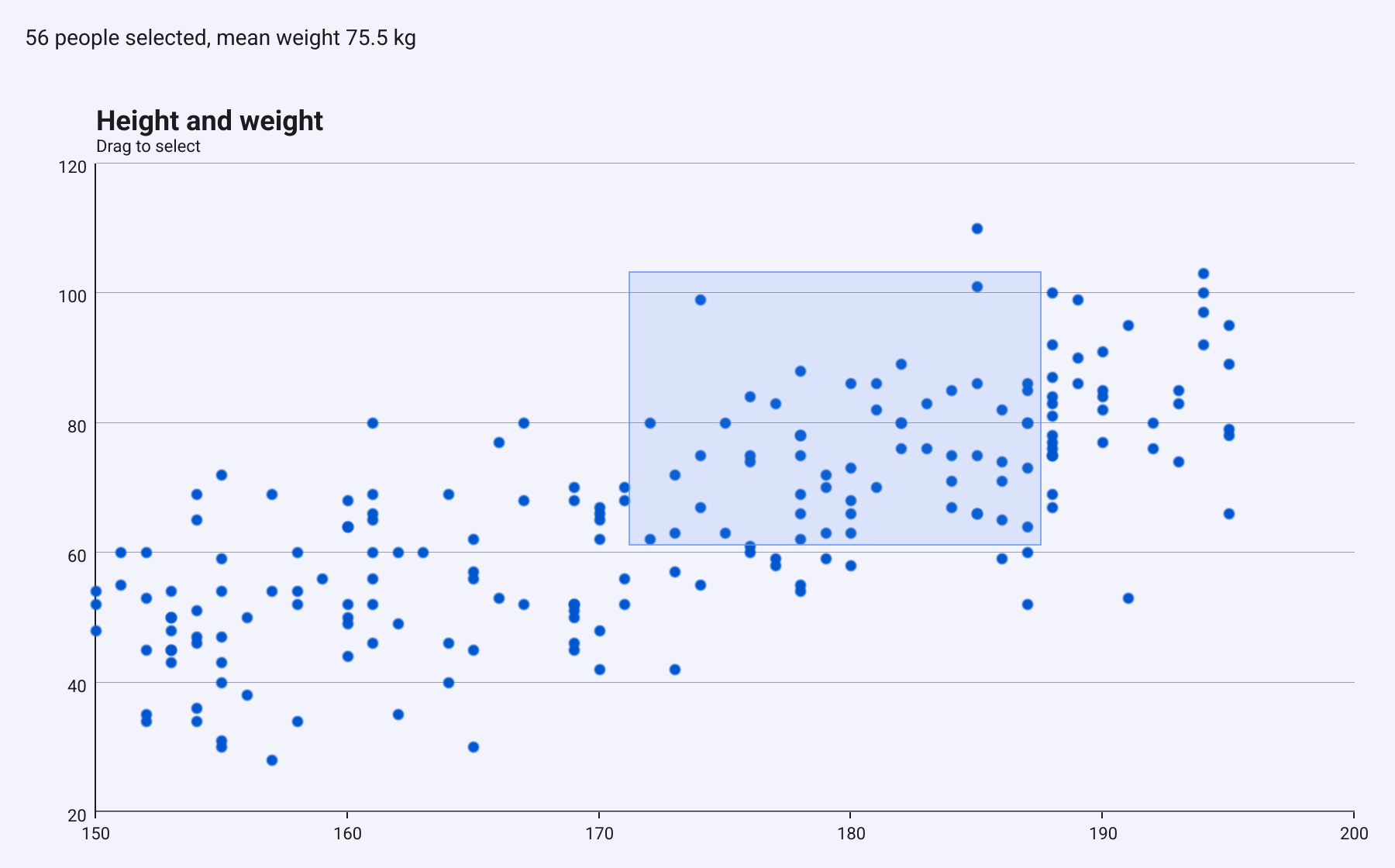
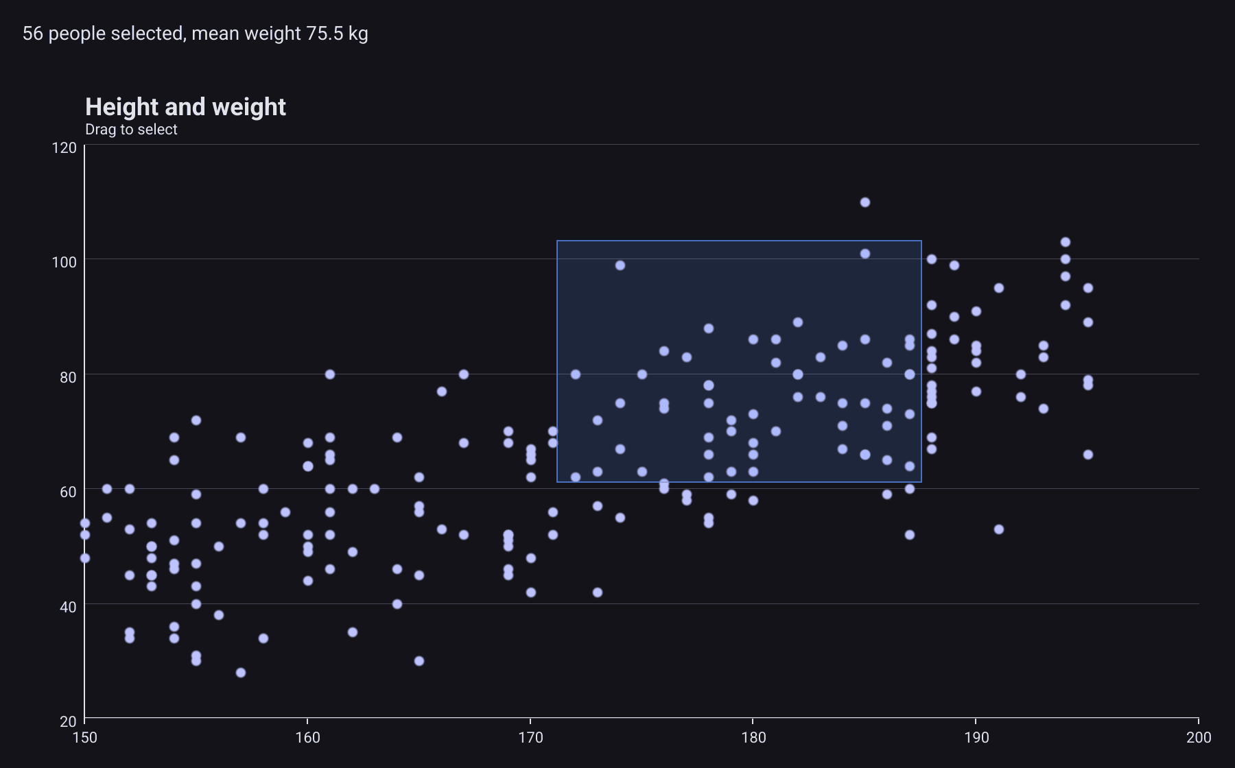
With Brush enabled, a drag over the plot draws a selection rectangle
instead of panning. When the user lets go, the chart sends
EventBrushSelect with the points inside the rectangle.
c := chart.New(chart.Option{
	Title:  &chart.Title{Text: "Height and weight", SubText: "Drag to select"},
	Brush:  &interact.BrushConfig{Enabled: true},
	Grid:   &chart.Grid{Left: 56, Right: 20, Top: 12, Bottom: 30},
	XAxis:  []axis.Config{{Type: axis.TypeValue}},
	YAxis:  []axis.Config{{Type: axis.TypeValue}},
	Series: []series.Series{&series.ScatterSeries{SeriesName: "People", Data: people, SymbolSize: 7}},
})

result := widget.NewLabel("Drag a rectangle over the points.")
c.Events.On(interact.EventBrushSelect, func(evt interface{}) {
	e := evt.(interact.BrushSelectEvent)
	if len(e.Selected) == 0 {
		result.SetText("Nothing selected")
		return
	}
	sum := 0.0
	for _, p := range e.Selected {
		sum += p.Value.Y // p.SeriesIndex and p.DataIndex locate the point
	}
	result.SetText(fmt.Sprintf("%d people selected, mean weight %.1f kg",
		len(e.Selected), sum/float64(len(e.Selected))))
})
Each
BrushSelectedPoint
has the SeriesIndex and DataIndex of the point and its Value. The
rectangle disappears when the drag ends, and the chart does not mark the
selected points: to highlight them, change the option yourself.
BrushSelectEvent also declares DataMinX, DataMaxX,
DataMinY and DataMaxY, but the chart leaves them at zero.Drill-down
Drill-down replaces the chart with a more detailed one when the user clicks a data point, and shows a breadcrumb trail to go back.
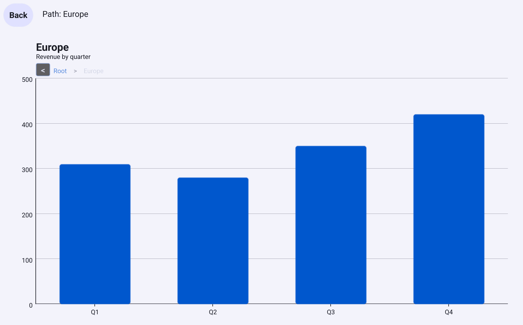
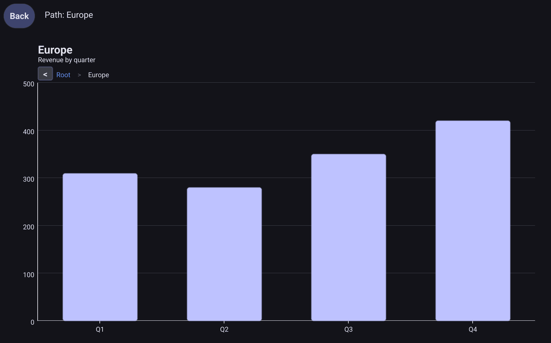
Set Drilldown.DataProvider to a function that returns the child option for
a clicked point, or nil when that point has nothing below it:
// region returns the child chart for one pie slice, or nil to not drill.
func region(hit interact.HitResult, path []string) *chart.Option {
	if len(path) > 0 {
		return nil // already one level down: the bars do not drill further
	}
	name := hit.Value.Label // a pie hit carries the slice name
	data, ok := quarterly[name]
	if !ok {
		return nil
	}
	return &chart.Option{
		Title:  &chart.Title{Text: name, SubText: "Revenue by quarter"},
		Grid:   &chart.Grid{Left: 56, Right: 20, Top: 12, Bottom: 30},
		XAxis:  []axis.Config{{Type: axis.TypeCategory, Data: []string{"Q1", "Q2", "Q3", "Q4"}}},
		YAxis:  []axis.Config{{Type: axis.TypeValue}},
		Series: []series.Series{&series.BarSeries{SeriesName: name, Data: data, CornerRadius: 4}},
	}
}
slices := []series.PieDataItem{}
for _, name := range []string{"Europe", "Americas", "Asia"} {
total := 0.0
for _, v := range quarterly[name] {
total += v
}
slices = append(slices, series.PieDataItem{Name: name, Value: total})
}
c := chart.New(chart.Option{
Title: &chart.Title{Text: "Revenue by region", SubText: "Click a slice"},
Series: []series.Series{&series.PieSeries{SeriesName: "Revenue", Data: slices, ShowLabels: true}},
Drilldown: &chart.DrilldownConfig{DataProvider: region},
})
where := widget.NewLabel("Top level")
c.Events.OnFiltered(interact.EventFilter{
EventTypes: []interact.EventType{interact.EventDrilldown, interact.EventDrillUp},
}, func(evt interface{}) {
e := evt.(interact.DrilldownEvent)
where.SetText("Path: " + strings.Join(e.Path, " > "))
})The function receives the clicked
HitResult
and the current path. It runs for every click on a data point, at every level:
a child option without its own Drilldown keeps the parent’s. Use the path,
as the example does, to stop at the last level.
The breadcrumb appears under the title once the user is below the top level:
- < goes up one level;
- Root goes back to the top;
- every level between them can be clicked; the last one, where the user is, cannot.
Each level’s name in the trail is the clicked point’s label. Pie slices have
one, their Name. For other series the label is empty and the series name is
used instead, so give the series a name that makes sense in the trail.
From code, DrillInto(label, option) goes one level down, DrillUp() one
level up, and DrillPath() returns the names of the levels. Going down or up
resets the legend and the zoom.
EventDrilldown and EventDrillUp fire for clicks on data points,
on < and for calls to DrillInto and DrillUp, but not for clicks on
Root or another level in the trail. DrilldownEvent.Hit is always nil.Timeline
A timeline steps through a sequence of charts, one per year for example.
component.TimelineState
keeps the current step and plays through the steps on a timer. It has no user
interface of its own and is not attached to a chart: it calls your function
with each step’s index, and your function sets the chart.
tl := component.NewTimelineState(len(years),
	component.TimelineConfig{Interval: 1500 * time.Millisecond, Loop: true},
	func(i int) {
		// Play calls this from its own goroutine: hop to the UI thread.
		bellui.Do(func() {
			c.SetOption(optionFor(i))
			year.SetText(fmt.Sprintf("%s (%d of %d)", years[i], i+1, len(years)))
		})
	})

controls := container.NewHBox(
	widget.NewButton("Previous", func() { tl.Stop(); tl.Prev() }),
	widget.NewButton("Play", tl.Play),
	widget.NewButton("Stop", tl.Stop),
	widget.NewButton("Next", func() { tl.Stop(); tl.Next() }),
	year,
)
How it behaves:
Next,PrevandGoTochange the step and call your function. They do not go past the first or the last step, except that withLoop,Nextgoes from the last step back to the first.Playadvances one step everyInterval(default 2 seconds). WithoutLoopit stops at the last step; withLoopit starts again at the first.Stopends playback.- During playback your function runs on a timer goroutine, not the UI thread,
so wrap chart and widget updates in
bellui.Do. TimelineStatehas no lock. Stop playback before stepping by hand, as the example does.TimelineConfig.AutoPlayhas no effect in v1.0.0: callPlayyourself.
With Animation: true in each option, SetOption animates from one step to
the next.
Colours by value
Option.VisualMap takes a list of
component.VisualMapConfig,
which describe a colour scale from Min to Max. In v1.0.0 the chart does
not use them: setting Option.VisualMap, or calling VisualMap on the
builder, changes nothing on screen.
The config’s own methods do work. MapColor returns the colour for a value,
blending between the colours in InRange.Colors, and MapSize returns a size
between InRange.SymbolSizeMin and SymbolSizeMax. Values outside Min and
Max get the colour or size at the nearest end. Use them where a series
takes a colour per item, such as pie slices:
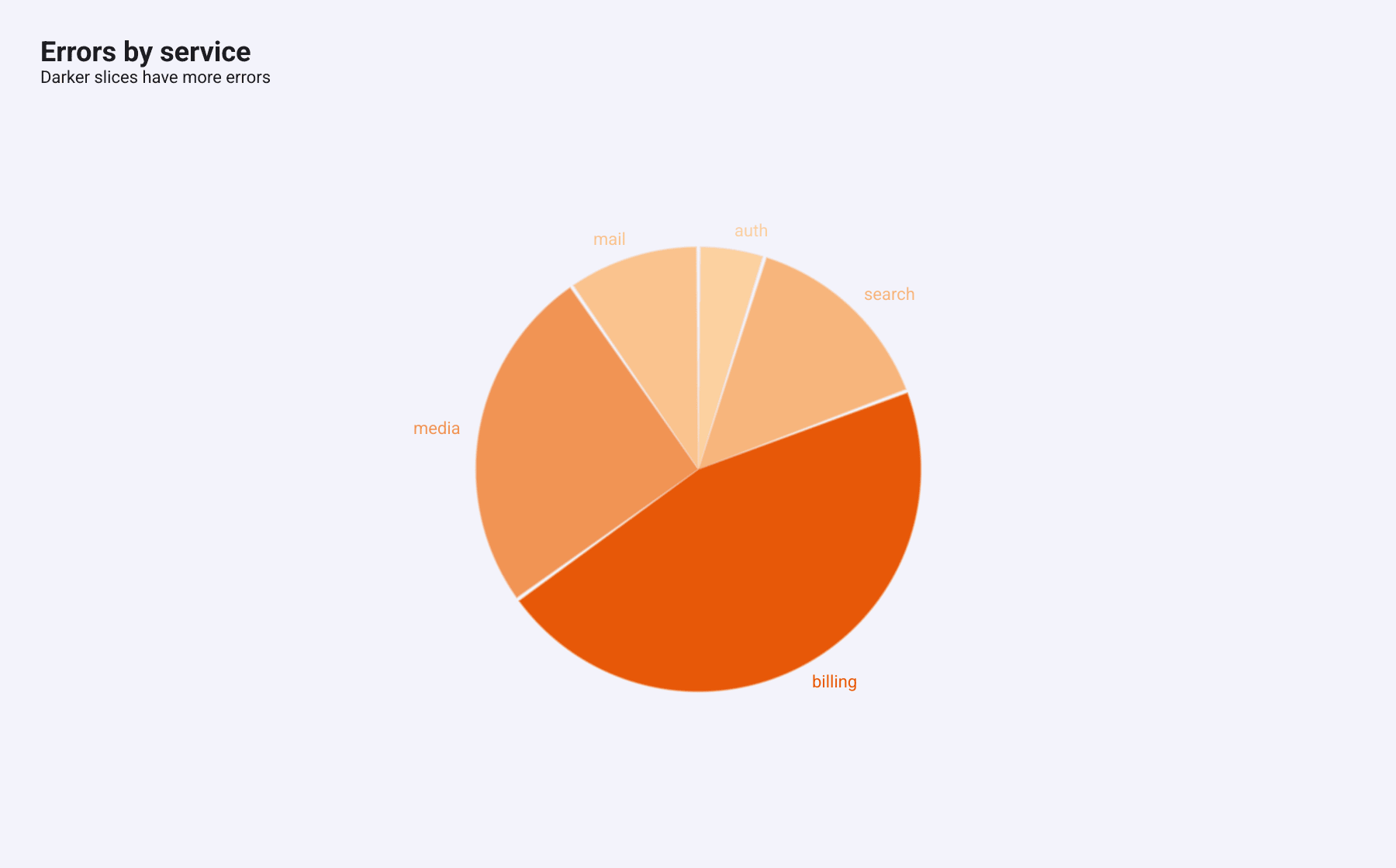
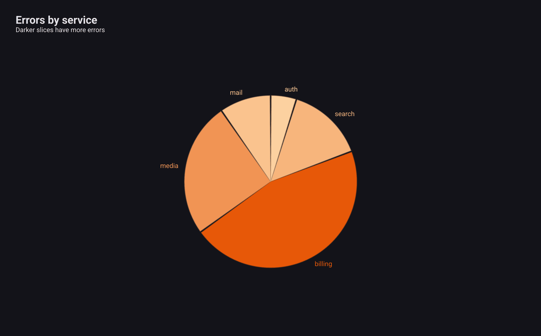
vm := component.VisualMapConfig{
	Min: 0, Max: 40,
	InRange: component.VisualMapRange{Colors: []color.Color{
		color.NRGBA{R: 255, G: 224, B: 178, A: 255}, // low
		color.NRGBA{R: 230, G: 81, B: 0, A: 255},    // high
	}},
}

errorsByService := map[string]float64{"auth": 4, "search": 12, "billing": 38, "media": 21, "mail": 8}
var slices []series.PieDataItem
for _, name := range []string{"auth", "search", "billing", "media", "mail"} {
	v := errorsByService[name]
	slices = append(slices, series.PieDataItem{Name: name, Value: v, Color: vm.MapColor(v)})
}
A heatmap has a colour scale of its own, ColorStops; see
Heatmap.