Navigation
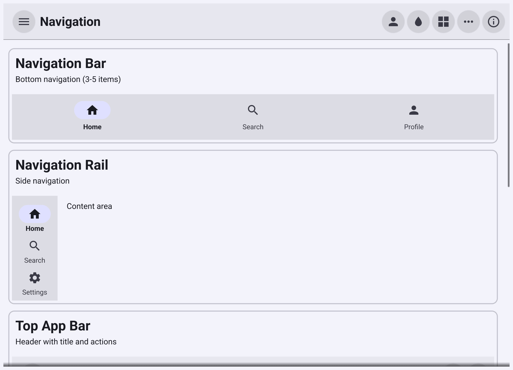
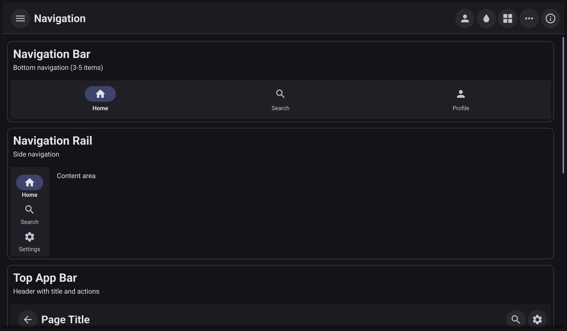
Navigation widgets move the user between the main screens of your app. They show destinations and report which one was tapped. Swapping the content is up to you.
Which one to use
| You want | Use |
|---|---|
| A title bar with a menu or back icon and actions | TopAppBar |
| 3 to 5 main destinations along the bottom, on a phone | NavigationBar |
| 3 to 7 destinations down the side, on a tablet or desktop | NavigationRail |
| Many destinations in a panel that slides in | NavigationDrawer |
| A bottom bar with actions and a FAB | BottomAppBar |
| Sections of one screen | tabs: container.NewAppTabs (see Layout) |
Navigation bar and rail
NavigationBar
and NavigationRail
take a list of items, each with a Label and an Icon, and a function that
receives the index of the tapped item. A tap also updates Selected, which
highlights the item. Set Selected yourself (then call Refresh) when the
destination changes some other way. The rail shows labels under its icons by
default; set ShowLabels to false for icons only.
var bar *widget.NavigationBar
var rail *widget.NavigationRail
show := func(i int) {
	content.SetText(pages[i])
	bar.Selected, rail.Selected = i, i
	bar.Refresh()
	rail.Refresh()
}

bar = widget.NewNavigationBar([]*widget.NavigationBarItem{
	{Label: "Home", Icon: theme.HomeIcon()},
	{Label: "Search", Icon: theme.SearchIcon()},
	{Label: "Profile", Icon: theme.AccountIcon()},
}, show)

rail = widget.NewNavigationRail([]*widget.NavigationRailItem{
	{Label: "Home", Icon: theme.HomeIcon()},
	{Label: "Search", Icon: theme.SearchIcon()},
	{Label: "Profile", Icon: theme.AccountIcon()},
}, show)
Place a bar at the bottom of a container.NewBorder and a rail at its
leading side. A common pattern is the bar on narrow windows and the rail on
wide ones; this example shows both so you can compare them.
Top app bar and navigation drawer
drawer := widget.NewNavigationDrawer([]*widget.NavigationDrawerItem{
	{Label: "Home", Icon: theme.HomeIcon()},
	{Label: "Search", Icon: theme.SearchIcon()},
	{Label: "Profile", Icon: theme.AccountIcon()},
	{IsDivider: true},
	{Label: "About", Icon: theme.InfoIcon()},
}, func(i int) {
	// i indexes Items, dividers included, so "About" is 4.
	if i < len(pages) {
		show(i)
		return
	}
	content.SetText("About")
})

top := widget.NewTopAppBar("My app", theme.MenuIcon(), func() {
	drawer.Toggle(w.Canvas())
})
top.Actions = []widget.TopAppBarAction{
	{Icon: theme.SettingsIcon(), OnTapped: func() { content.SetText("Settings") }},
}
TopAppBar
shows a Title, a leading navigation icon that calls OnNavigation, and
trailing Actions, each a
TopAppBarAction
with an icon and a function.
NavigationDrawer
is a side panel that you open over the content with Show(canvas) or
Toggle(canvas), and close with Hide(). It is modal by default: the rest
of the window is dimmed while it is open, and a tap outside the drawer closes
it. Tapping a destination calls OnChanged and closes the drawer.
- An item with
IsDivider: truedraws a separator line. Dividers count as items, so indexes passed toOnChangedinclude them. Headeradds content, such as an account name, above the items.
Bottom app bar
BottomAppBar
is a bar of icon actions with an optional FAB on its right. Pass nil
for the FAB if you do not need one.
fab := widget.NewFAB(theme.ContentAddIcon(), func() { status.SetText("New") })
bottom := widget.NewBottomAppBar([]*widget.BottomAppBarAction{
	{Icon: theme.SearchIcon(), OnTapped: func() { status.SetText("Search") }},
	{Icon: theme.DeleteIcon(), OnTapped: func() { status.SetText("Delete") }},
}, fab)
Place it at the bottom of a container.NewBorder, like a navigation bar.