Feedback
Feedback widgets tell the user that something is happening, has happened or needs attention. None of them takes input, apart from the optional action button on a snackbar.
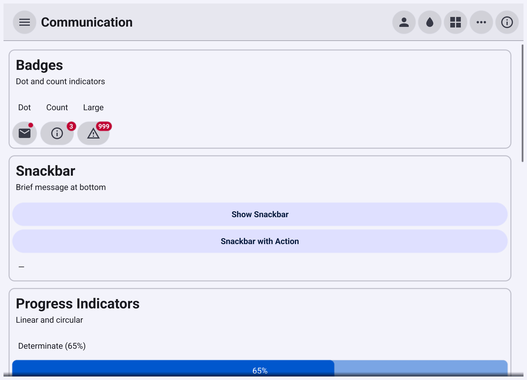
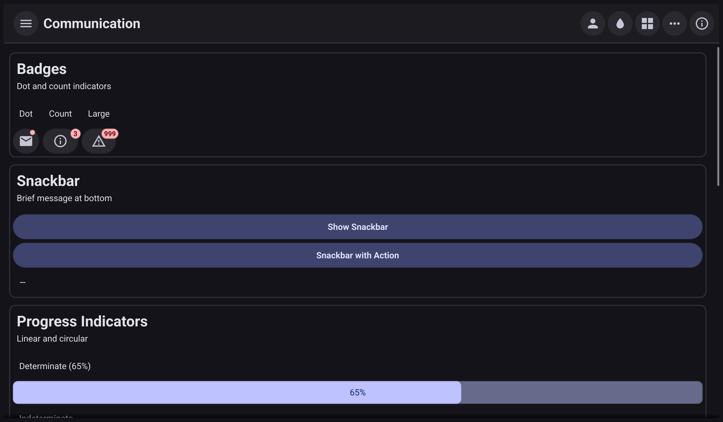
Which one to use
| You want to show | Use |
|---|---|
| How far a task has got | ProgressBar |
| That a task is running, length unknown, as a bar | ProgressBarInfinite |
| That something is busy, in a small space | Activity |
| Where content will appear once it has loaded | LoadingIndicator |
| That something has new items, or how many | Badge |
| A short message with an optional action, such as Undo | Snackbar |
| A short message the user does not need to act on | Toast |
Progress
download := widget.NewProgressBar()
download.TextFormatter = func() string {
	return fmt.Sprintf("%.0f of 100 MB", download.Value*100)
}
go func() {
	for i := 0; i <= 100; i++ {
		time.Sleep(50 * time.Millisecond)
		download.SetValue(float64(i) / 100) // safe from any goroutine
	}
}()

waiting := widget.NewProgressBarInfinite()
stop := widget.NewButton("Stop", waiting.Stop)
ProgressBar
fills from Min to Max, which are 0 and 1 by default, and shows the value
as a percentage. TextFormatter replaces that text with your own.
SetValue is safe to call from any goroutine, so a background task can
report progress directly. NewProgressBarWithData connects the value to a
binding.Float.
ProgressBarInfinite
loops for as long as it runs. Stop() stops the animation, Start() starts it
again and Running() reports which.
Activity and loading placeholders
spinner := widget.NewActivity()
spinner.Start()

avatar := widget.NewLoadingIndicator(widget.LoadingShapeCircle)
line := widget.NewLoadingIndicator(widget.LoadingShapeText)
Activity
is a small animated busy indicator. Call Start() to animate it and Stop()
when the work is done.
LoadingIndicator
is a shimmering placeholder in the shape of the content to come:
LoadingShapeRect for cards and images, LoadingShapeCircle for avatars and
LoadingShapeText for lines of text. Swap it for the real content when it
arrives.
Badge
Badge
attaches a small indicator to another widget, usually an icon button.
NewBadge shows a dot. NewBadgeWithCount shows a number; counts above 999
show as “999+”. Change Count and call Refresh() to update it, and set it
to 0 for a dot.
inbox := widget.NewBadgeWithCount(widget.NewIconButton(theme.MailComposeIcon(), nil), 3)
updates := widget.NewBadge(widget.NewIconButton(theme.DownloadIcon(), nil))
Snackbar
A Snackbar
is a short message at the bottom of the window, with an optional action
button. It closes by itself after Duration (4 seconds by default), or when
the user taps the action. Taps elsewhere do not close it.
archive := widget.NewButton("Archive", func() {
	removed := items
	items = nil
	list.SetText("(empty)")
	widget.ShowSnackbar("2 files archived", "Undo", func() {
		items = removed
		list.SetText("a.txt, b.txt")
	}, w.Canvas())
})
ShowSnackbar(text, actionText, action, canvas) creates and shows one. Pass
an empty actionText for a message without a button. To change Duration
first, create it with NewSnackbar, set the field and call Show(canvas).
Hide() closes it early and is safe from any goroutine.
Toast
A Toast is a
brief notice near the bottom of the window. It closes after 3 seconds and
does not block input: taps go through to whatever is underneath.
save := widget.NewButton("Save", func() {
	widget.ShowToastWithImportance("Saved", widget.SuccessImportance, w.Canvas())
})
ShowToast uses neutral colours. ShowToastWithImportance takes
DangerImportance, WarningImportance or SuccessImportance for the
theme’s error, warning and success colours. Both return the Toast, so you
can call Dismiss() to close it early.
Both snackbars and toasts are read out by screen readers when they appear. Danger and warning toasts interrupt what the screen reader is saying; the others wait their turn.