Containment and overlays
Some widgets exist to hold other content. Cards, accordions and carousels group it in place. Sheets, pop-ups, menus and tooltips float above the rest of the window for a moment.
Which one to use
| You want | Use |
|---|---|
| A titled box around related content | Card |
| Sections the user expands one at a time | Accordion |
| A row of items the user steps through one at a time | Carousel |
| Extra actions or content sliding up from the bottom | BottomSheet |
| Supplementary details beside the main content | SideSheet |
| Any content floating above the window | PopUp |
| A right-click menu on a widget | ContextMenu |
| A menu opened from a button | ShowPopUpMenuAtRelativePosition |
| A short hint on hover | SetToolTipText, or Tooltip for non-widget content |
For a dialog with a title and buttons, such as a confirmation, use the
dialog package.
Card
Card shows a
Title, a Subtitle, optional Content below them and an optional Image
above them. Any of these can be left empty.
order := widget.NewCard("Order #1042", "Shipped yesterday",
	widget.NewButton("Track parcel", func() {}))

plan := widget.NewCard("Pro plan", "Billed yearly", widget.NewLabel("All features included"))
plan.Style = widget.CardStyleOutlined
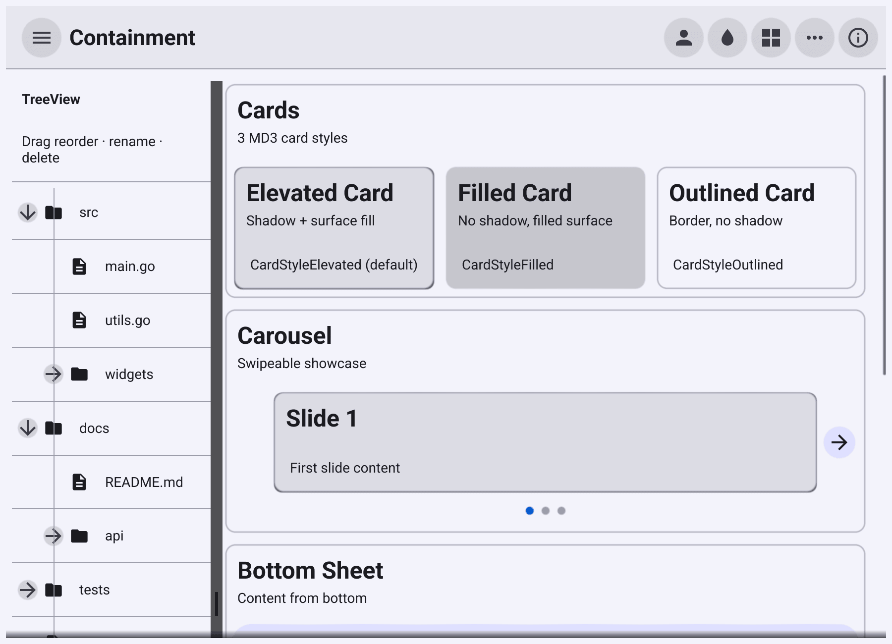
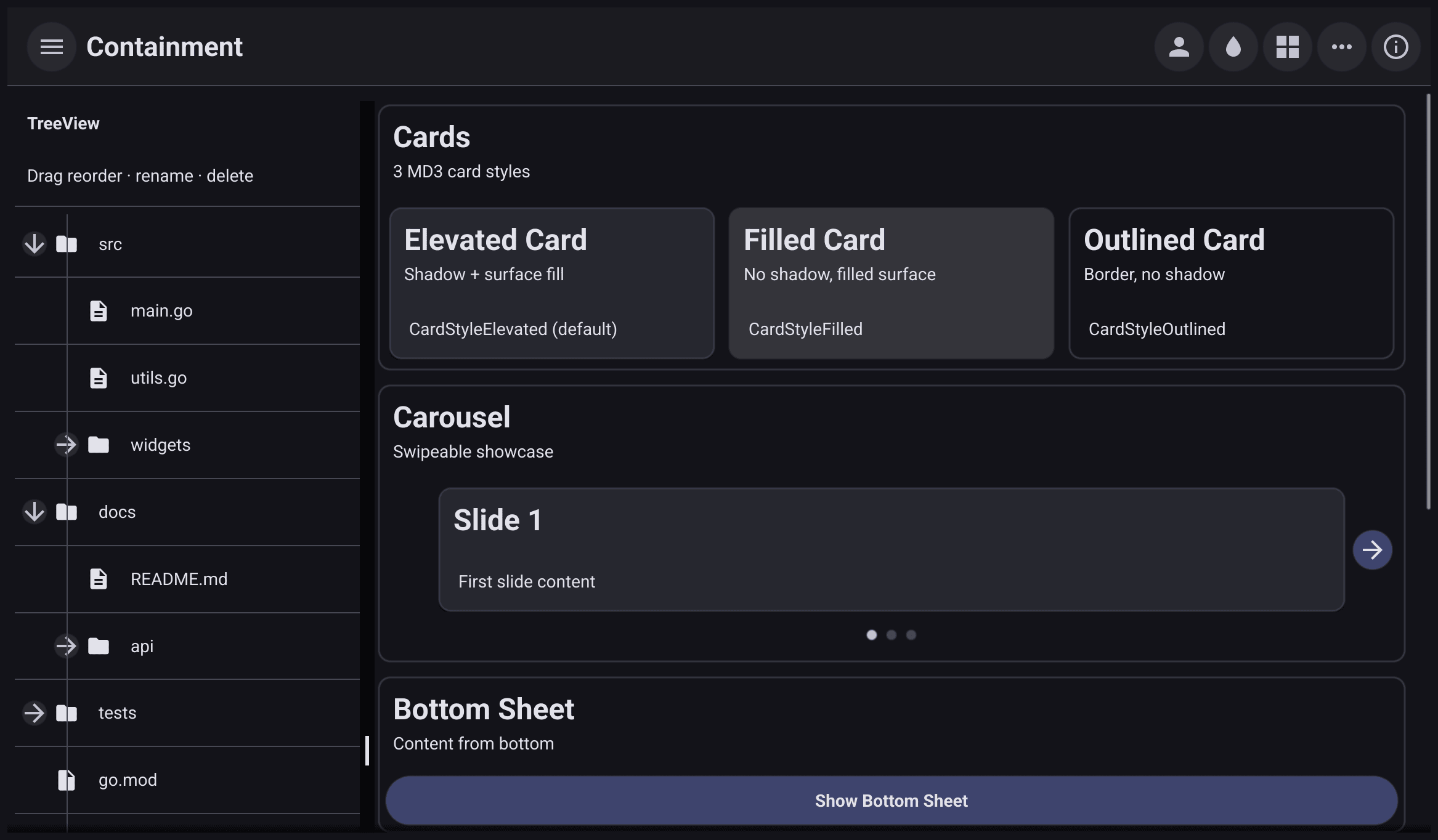
Style is one of the three MD3 card variants: CardStyleElevated (the
default, with a shadow), CardStyleFilled (a filled surface, no shadow) and
CardStyleOutlined (a border, no shadow). SetTitle, SetSubTitle,
SetContent and SetImage change a card that is already shown.
Accordion
Accordion
stacks items, each a title that expands to show its Detail when tapped.
faq := widget.NewAccordion(
	widget.NewAccordionItem("How do I reset my password?",
		widget.NewLabel("Use the link on the sign-in page.")),
	widget.NewAccordionItem("Can I export my data?",
		widget.NewLabel("Yes, from Settings > Export.")),
)
faq.MultiOpen = true
faq.Open(0)
By default opening one item closes the others. Set MultiOpen to let several
stay open. Open(i), Close(i), OpenAll() and CloseAll() work from
code; without MultiOpen, OpenAll opens only the first item. Append,
Prepend, Remove and RemoveIndex change the items.
Carousel
Carousel
shows one item at a time, with previous and next buttons beside it and a row
of dots below that marks the current item. Dragging does not move it.
var slides []core.CanvasObject
for i := 1; i <= 4; i++ {
	slides = append(slides, widget.NewCard(fmt.Sprintf("Slide %d", i), "", nil))
}
carousel := widget.NewCarousel(slides...)
carousel.OnChanged = func(i int) {
	w.SetTitle(fmt.Sprintf("Containment: slide %d", i+1))
}
CurrentItem is the index shown and OnChanged receives it after each move.
Next() and Previous() move from code.
Bottom and side sheets
showShare := widget.NewButton("Share…", func() {
	sheet := widget.NewBottomSheet(nil)
	sheet.Modal = true
	sheet.Content = container.NewVBox(
		widget.NewLabel("Share to"),
		widget.NewButton("Copy link", func() { sheet.Hide() }),
		widget.NewButton("Cancel", func() { sheet.Hide() }),
	)
	sheet.Show(w.Canvas())
})
BottomSheet
slides up from the bottom edge of the canvas you pass to Show. It is at
most 640 units wide and centred. Hide() closes it.
showDetails := widget.NewButton("Details", func() {
	widget.ShowSideSheet(container.NewVBox(
		widget.NewLabel("Size: 2.4 MB"),
		widget.NewLabel("Modified: today"),
	), w.Canvas())
})
SideSheet
opens at the right side of the canvas. ShowBottomSheet and ShowSideSheet
create and show a sheet in one call.
Sheets are not modal by default, so a tap outside closes them. Set Modal
before Show to dim the window and block it until your code calls Hide.
Escape closes either kind.
PopUp
PopUp
floats any content above a canvas, with padding and a shadow. Sheets and
dialogs are built on it.
var pop *widget.PopUp
pop = widget.NewModalPopUp(container.NewVBox(
	widget.NewLabel("Are you still there?"),
	widget.NewButton("Yes", func() { pop.Hide() }),
), w.Canvas())
showPop := widget.NewButton("Pop-up", func() { pop.Show() })NewPopUpandNewModalPopUpcreate a pop-up without showing it. Show it withShow(),ShowAtPosition(pos)orShowAtRelativePosition(pos, obj), and close it withHide().ShowPopUp,ShowModalPopUp,ShowPopUpAtPositionandShowPopUpAtRelativePositioncreate and show one in a single call.- A normal pop-up closes when the user taps outside it. A modal one covers the window with a dimmed overlay, ignores taps outside, and stays until your code hides it. Escape closes both.
- Set
OnDismissedto run your own close logic instead of the plain hide when the user presses Escape. A tap outside a normal pop-up still hides it directly.
Menus
file := widget.NewContextMenu(widget.NewLabel("report.pdf"),
	bellui.NewMenuItem("Open", func() { status.SetText("Open") }),
	bellui.NewMenuItem("Rename", func() { status.SetText("Rename") }),
	bellui.NewMenuItemSeparator(),
	bellui.NewMenuItem("Delete", func() { status.SetText("Delete") }),
)
ContextMenu
wraps any object and shows a menu of
bellui.MenuItems
on right-click (a secondary tap). Taps, hovers and drags still reach the
wrapped object. NewContextMenuWithMenu takes a ready-made *bellui.Menu
instead of items.
To open a menu from a button, pass a *bellui.Menu to
ShowPopUpMenuAtRelativePosition, with a position relative to the button:
sortMenu := bellui.NewMenu("",
	bellui.NewMenuItem("By name", func() { status.SetText("Sort by name") }),
	bellui.NewMenuItem("By date", func() { status.SetText("Sort by date") }),
)
var sort *widget.Button
sort = widget.NewButtonWithIcon("Sort", theme.MenuDropDownIcon(), func() {
	widget.ShowPopUpMenuAtRelativePosition(sortMenu, w.Canvas(),
		geo.NewPos(0, sort.Size().Height), sort)
})
ShowPopUpMenuAtPosition takes an absolute position instead, and
NewPopUpMenu creates a menu you can show again and again.
Tooltips
Every widget has SetToolTipText. On desktop, the text appears in a small
bubble after the pointer rests on the widget for a moment, and disappears
when it leaves. An empty string removes the tooltip.
refresh := widget.NewIconButton(theme.ViewRefreshIcon(), func() { status.SetText("Refreshed") })
refresh.SetToolTipText("Reload the list")

info := widget.NewTooltip(widget.NewIcon(theme.InfoIcon()), "Files are kept for 30 days")
Tooltip
does the same as a wrapper, which is useful for content that is not a widget,
such as a canvas object.