Widgets
The widget package
holds every ready-made control in Bellui: buttons, text fields, pickers,
navigation bars, lists, tables and more. They follow Material Design 3 (MD3),
so most widgets have the MD3 variants as a Style field: filled, tonal,
outlined and so on. Colours come from the theme, so every
widget follows light and dark mode without extra code.
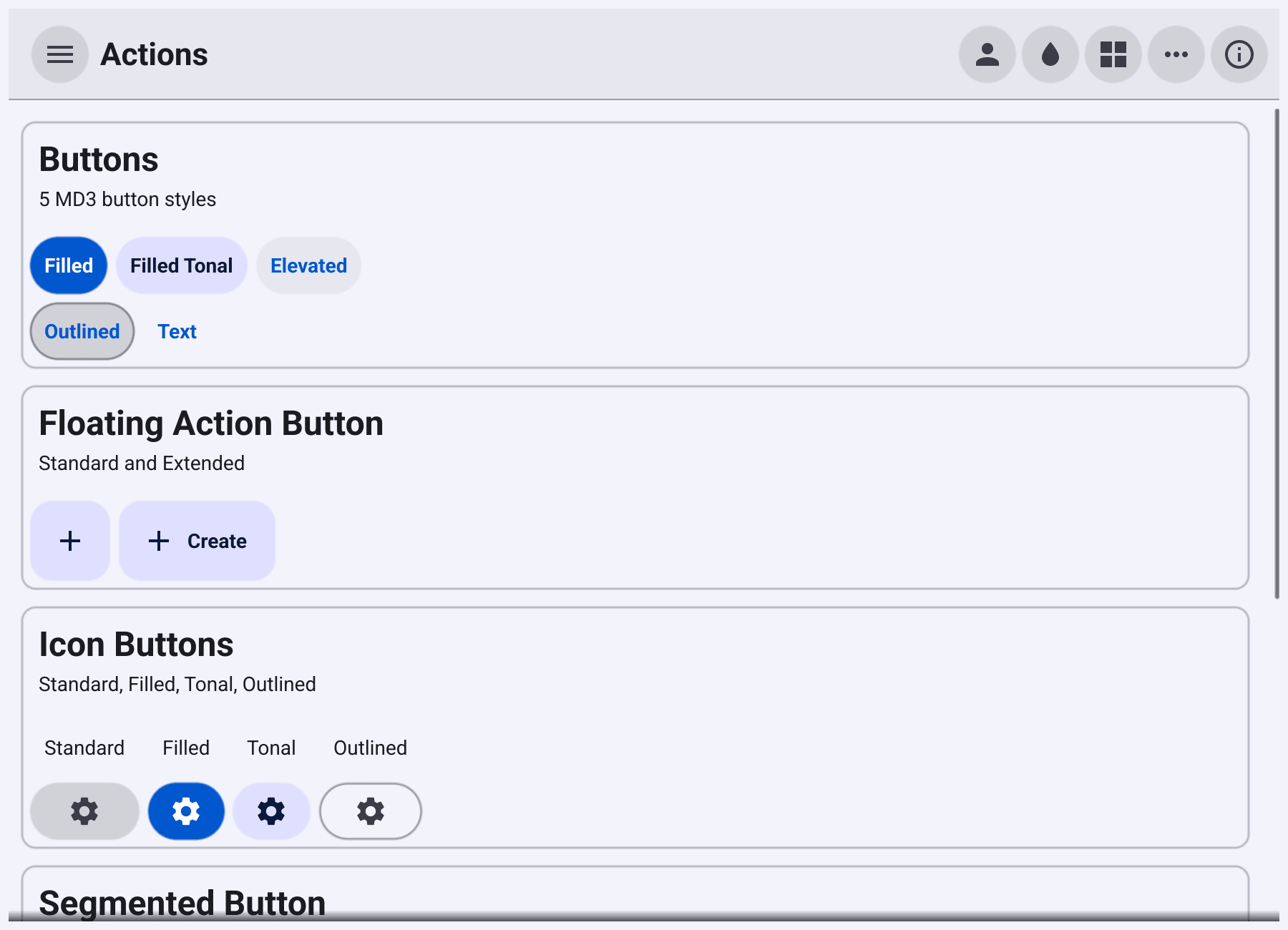
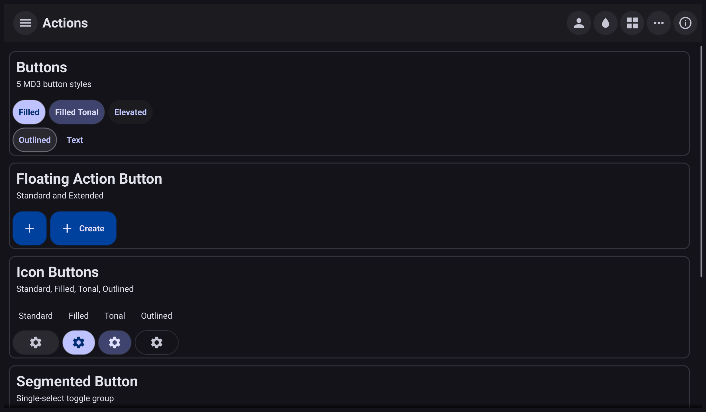
The gallery app shows most of these
widgets in one window. Clone it and run go run . to try them.
Things every widget shares
Create widgets with their constructor. Every widget has a NewX
function, for example widget.NewButton or widget.NewSlider. Set extra
fields on the result before you show it. You can also build a widget as a
struct literal, such as &widget.Chip{Text: "go", Style: widget.ChipStyleInput}.
The constructors call ExtendBaseWidget for you. When you build a widget as a
struct literal, call w.ExtendBaseWidget(w) on it before you use its methods.
Change fields, then refresh. Exported fields such as Text, Style or
Selected are read when the widget draws. If you change a field after the
widget is on screen, call Refresh() so it redraws. Setter methods such as
Label.SetText, Button.SetText or ProgressBar.SetValue refresh for you,
and their documentation says when they are safe to call from any goroutine.
Callbacks such as OnTapped and OnChanged run on the UI thread, so they can
update other widgets directly.
Hide, disable and describe. Every widget has Show(), Hide() and
Visible(). Most input widgets, such as buttons, entries, check boxes,
switches and sliders, also have Disable(), Enable() and Disabled().
Some interactive widgets do not, for example Chip, SegmentedButton,
Hyperlink and RichEntry. SetToolTipText adds a hover tooltip to any widget, and
SetAccessibilityLabel names a widget that has no visible text, such as an
icon button, for screen readers.
Data binding. A few widgets have a NewXWithData constructor that
connects them to a value from the
data/binding
package: Check, Entry, Label, ProgressBar, Select, Slider, List, GridWrap and
Tree. All of these except List, GridWrap and Tree also have a Bind method
for a widget you already created. Binding is covered in Data binding.
Tabs are containers, not widgets: see container.NewAppTabs and
container.NewDocTabs in Layout. Dialogs are in the
dialog package.