Fonts and typography
The bundled fonts
Bellui compiles its fonts into your app, so text looks the same on every platform:
| Text | Font |
|---|---|
| Regular, italic, bold, bold italic, medium, medium italic | Roboto |
| Monospace (regular, italic, bold, bold italic) | Office Code Pro |
Text with Symbol set in its style | Inter Symbols |
| Symbol fallback (arrows, ✓, ⌘, maths and punctuation gaps) | subsets of Noto Sans Symbols, Symbols 2, Punctuation and Math |
| Emoji | EmojiOne Color |
When a font has no glyph for a character, Bellui looks in fallback fonts before it tries the system’s fonts. The symbol subsets are such fallbacks: they keep symbols the same size on every platform. Chinese, Japanese and Korean are not in the bundled set; see Other scripts below.
Two build tags leave fonts out to make the binary smaller:
-tags no_emoji drops the emoji font, and -tags no_symbols drops the
symbol subsets (about 390 KB).
Text styles
A bellui.TextStyle
describes how text is drawn. widget.Label and canvas.Text have a
TextStyle field. widget.Label also has a SizeName field that picks a
text size from the theme:
title := widget.NewLabel("Monthly report")
title.SizeName = theme.SizeNameHeadlineSmall // 24 in the default theme
title.TextStyle = bellui.TextStyle{Bold: true}

note := widget.NewLabel("Figures are provisional.")
note.TextStyle = bellui.TextStyle{Italic: true}

code := widget.NewLabel("go run .")
code.TextStyle = bellui.TextStyle{Monospace: true}
The fields you will use most:
Bold,Italic,Monospace,UnderlineandStrikethroughare on or off.Weightsets a weight from 100 to 900, with constants frombellui.WeightThintobellui.WeightBlack. When it is nil,Bolddecides: 700 if set, 400 if not. The bundled fonts have regular (400), medium (500) and bold (700) faces.LineHeightScalemultiplies the line height.LetterSpacingadds space between characters, in the same units as sizes; a negative value tightens them.Directionsets the base writing direction of the text. See Right-to-left layout.Languageis a BCP 47 language tag used when shaping the text, for example"sr-Cyrl"for Serbian Cyrillic letter forms. When empty, the app’s locale is used.
Weight, LineHeightScale and LetterSpacing are pointers, so that “not
set” differs from zero. bellui.Ptr
makes a pointer from a value in a struct literal:
bellui.Ptr(bellui.WeightMedium).
The MD3 type scale
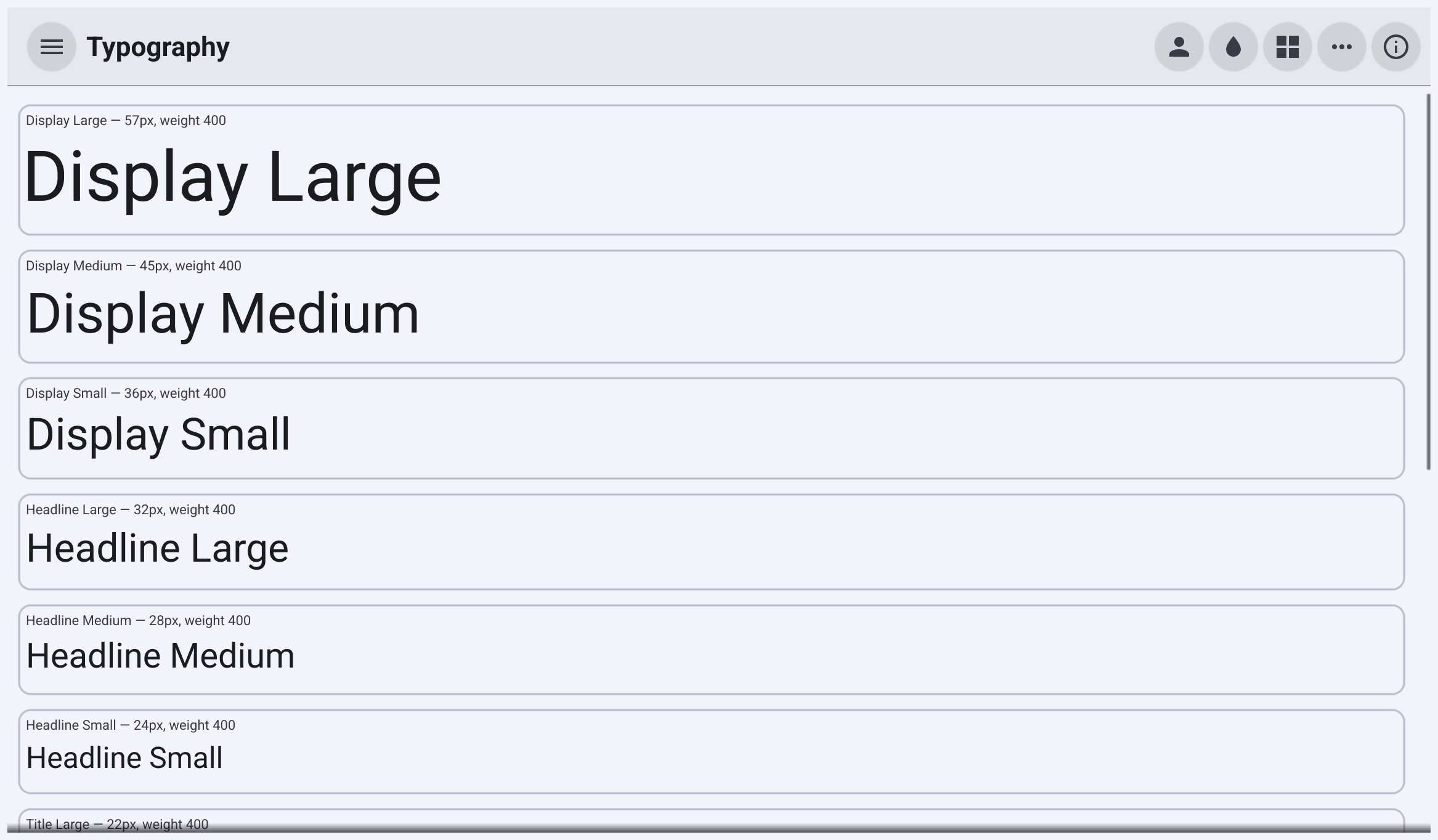
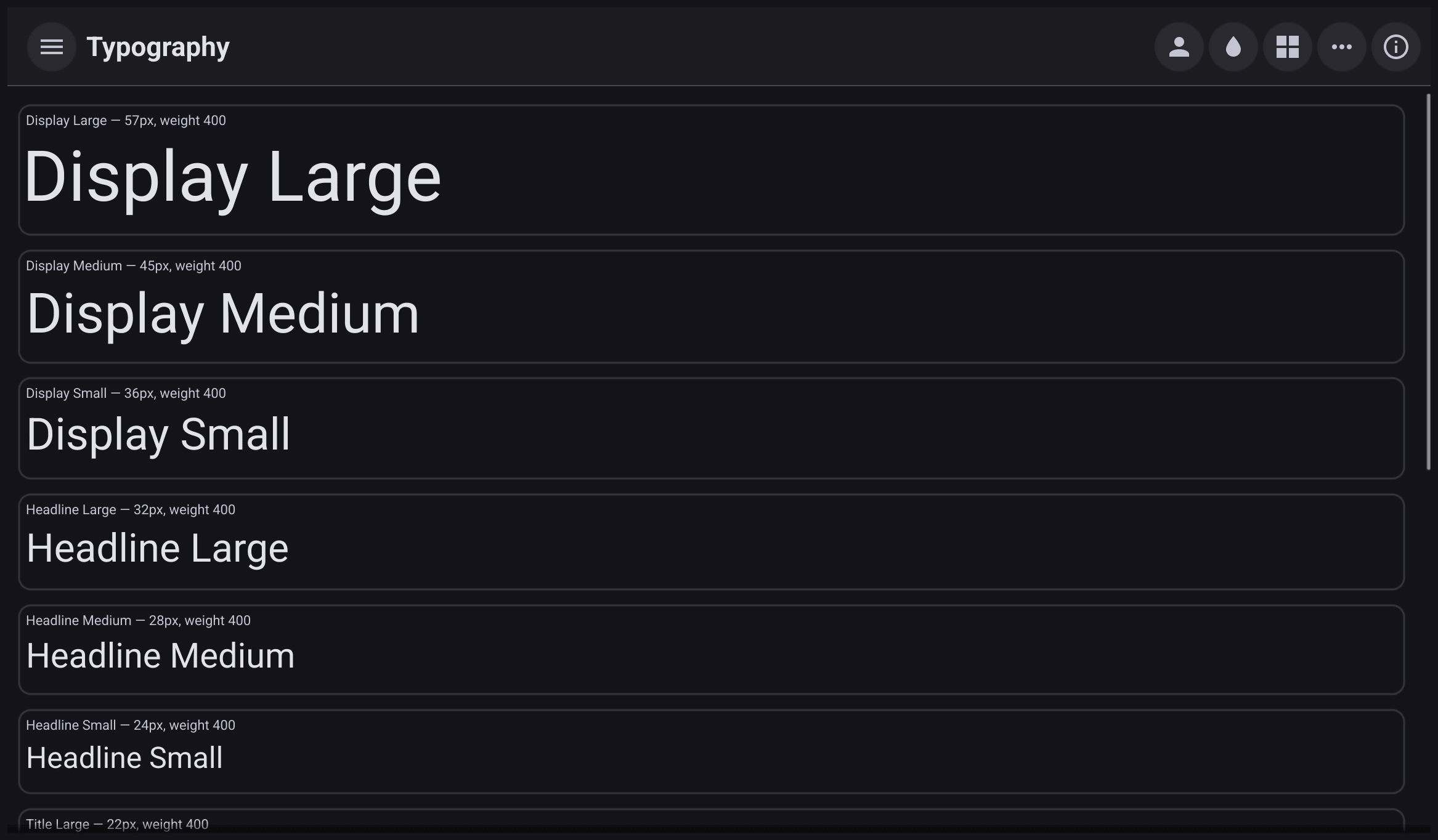
Material Design 3 defines fifteen text roles in five groups. Each has a size name in the theme, and the default theme gives them these sizes:
| Group | Large | Medium | Small |
|---|---|---|---|
| Display | 57 | 45 | 36 |
| Headline | 32 | 28 | 24 |
| Title | 22 | 16 | 14 |
| Body | 16 | 14 | 12 |
| Label | 14 | 12 | 11 |
The size names are theme.SizeNameDisplayLarge through
theme.SizeNameLabelSmall. The dense theme
makes them about 15% smaller.
For each role, the theme package also has a matching TextStyle with the
role’s weight, line height and letter spacing, such as
theme.TypographyBodyMedium.
Use the two together:
display := canvas.NewText("42 °C", theme.Color(theme.ColorNameForeground))
display.TextSize = theme.Size(theme.SizeNameDisplayMedium) // 45
display.TextStyle = theme.TypographyDisplayMedium

medium := canvas.NewText("Medium weight", theme.Color(theme.ColorNameForeground))
medium.TextSize = theme.Size(theme.SizeNameTitleMedium)
medium.TextStyle = bellui.TextStyle{Weight: bellui.Ptr(bellui.WeightMedium)}
canvas.Text draws in the colour you give it. Unlike a widget, it does not
change colour when the theme variant changes. Prefer a widget.Label for text
that must follow the theme.
The older general sizes still exist: theme.SizeNameText (14 in the default
theme), SizeNameHeadingText (24), SizeNameSubHeadingText (18) and
SizeNameCaptionText (11).
Use your own font
There are three ways, from narrowest to widest:
- One piece of text. Set
FontSourceon acanvas.Textto a font resource. That text then ignores the theme’s fonts. Styles the font file does not contain, such as bold from a regular-only file, may not be available. - The whole app. Return your font resources from the
Fontmethod of a custom theme.Fontreceives theTextStyle, so you can return a different file for bold, italic or monospace text. - On your own machine, without code. The default theme reads three
environment variables at startup.
BELLUI_FONTis the path to a regular font file. Bellui loads the bold, italic and bold italic files by replacingRegularin that path, and uses the regular font for any it cannot find.BELLUI_FONT_MONOSPACEandBELLUI_FONT_SYMBOLset the monospace and symbol fonts.
BELLUI_FONT=/usr/share/fonts/noto/NotoSerif-Regular.ttf go run .Other scripts
For scripts the bundled fonts do not cover, add a fallback font. Bellui looks in registered fallback fonts, in the order they were registered, for any character the theme’s font lacks.
For Chinese, Japanese and Korean, import the
theme/cjk
package for its side effect:
_ "github.com/belluikit/bellui/theme/cjk" // registers a CJK fallback fontIt registers a subset of Noto Sans CJK SC that covers common Han characters, Hiragana, Katakana, common Hangul and CJK punctuation. It adds about 6.5 MB to your binary, and only to binaries that import it.
For any other script, or for characters outside that subset, register your
own font with
bellui.RegisterFontFallback.
Do it once at startup, before you build the UI. This also works on the web,
where the browser’s system fonts are not available to the app.